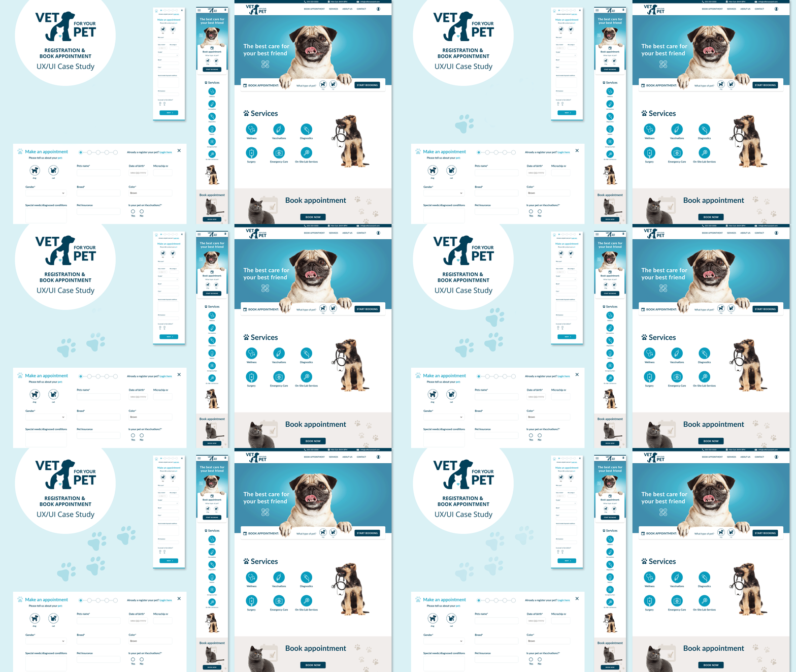
Project overview
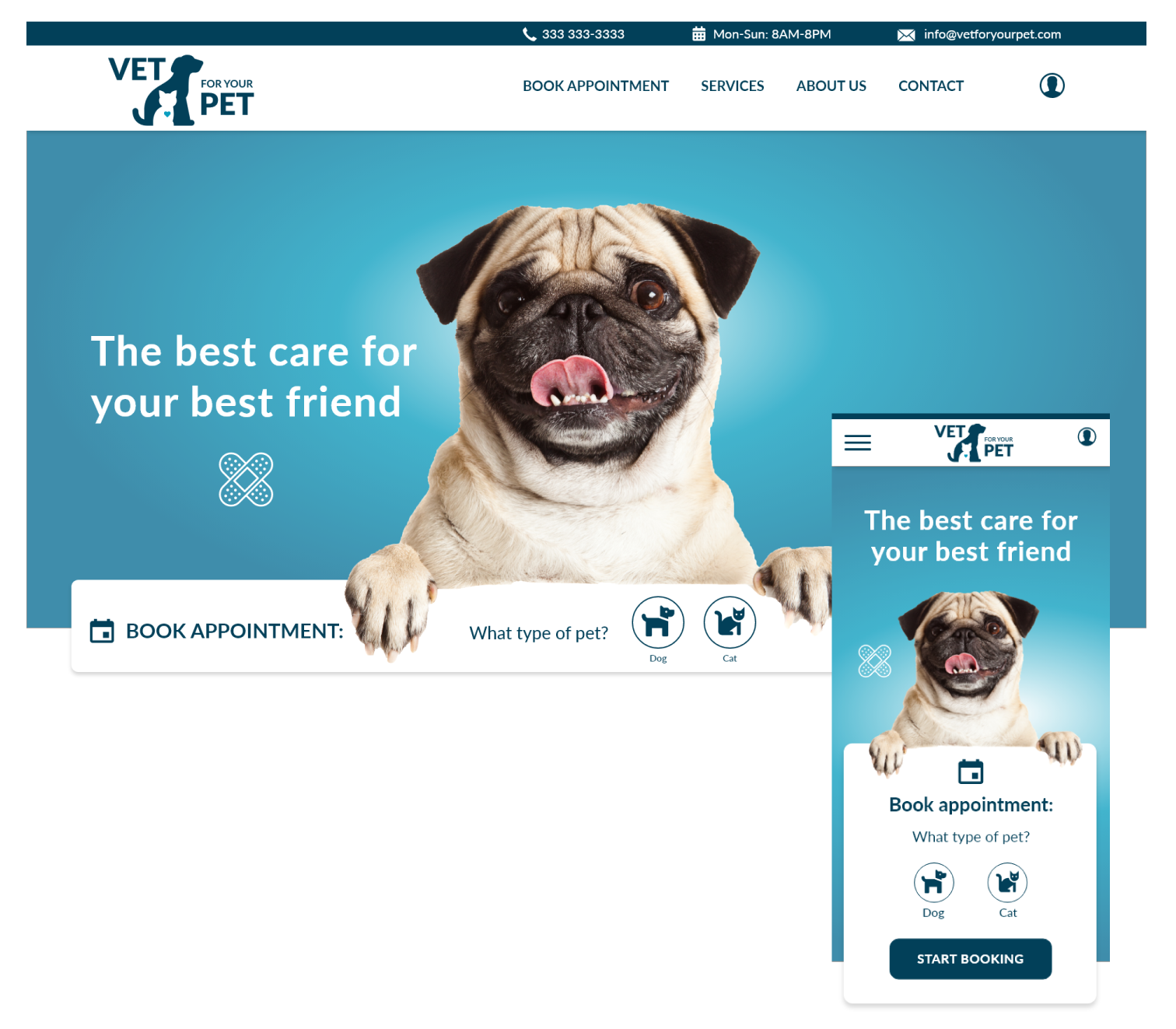
The product:
Vet for your pet focuses on offering both routine and emergency pet care for cats and dogs in Delray Beach and the surrounding areas. The vet clinic provides premium vet care at an affordable price. They target users with busy lifestyles and therefore offer convenient extended hours from 8 am to 8 pm 7 days a week.
Project duration:
January 2023 to March 2023
My role:
UX designer leading the Vet for your Pet website design.
My responsibilities:
Conducting interviews, paper and digital wireframing, low and high-fidelity prototyping, conducting usability studies, accounting for accessibility, and iterating on designs and responsive design.
Tools:
Adobe Xd, Photoshop and Illustrator.
The problem
Vet clinic websites have confusing registration and booking of vet appointments and you still have to fill out more paperwork by downloading it or fill it out in the vet office when you want to focus your time on your pet.
The goal
Design a website that is user-friendly for Vet for your Pet by providing clear registration and booking online without having to fill out extra paperwork in the vet office, so the user can focus on their pet.
UnderstandING the User
User research, empathy map, persona, user journey map, site map and user pain points
USER research summary
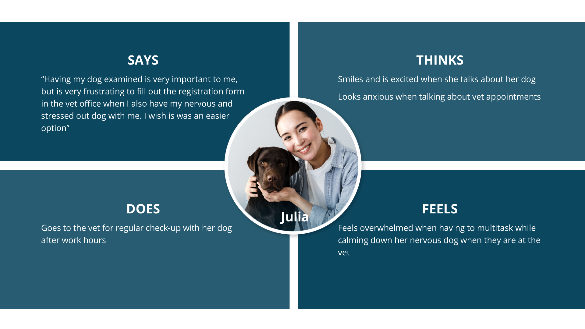
I conducted user interviews which I then turned into empathy maps to better understand the target users and their needs. A primary user group identified through research was busy professionals with pets that have limited time during the day to register and schedule vet appointments. An option for easy online registering and scheduling appointments was the biggest factor for the users without any extra paperwork while in the vet’s office. Research also revealed that it will be beneficial to have the option to check in and out online as well as get a notification on when the vet exam starts for animals that get easily stressed at the vet office.
Persona: Julia
Problem statement:
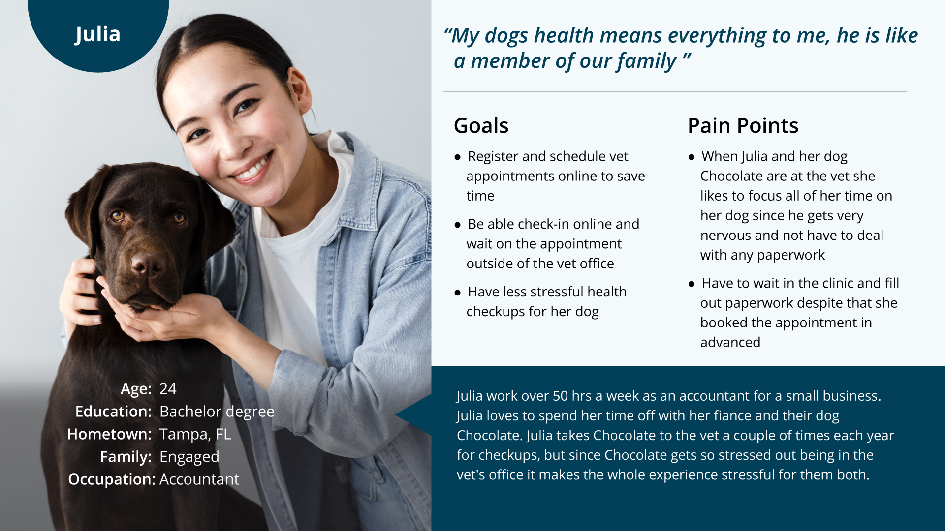
Julia is a busy professional and dog lover who needs an easier and faster option to register and schedule a vet appointment for her dog because she wants to focus on her anxious dog when they are at the vet office and not deal with any paperwork in a stressful situation.
User Journey Map
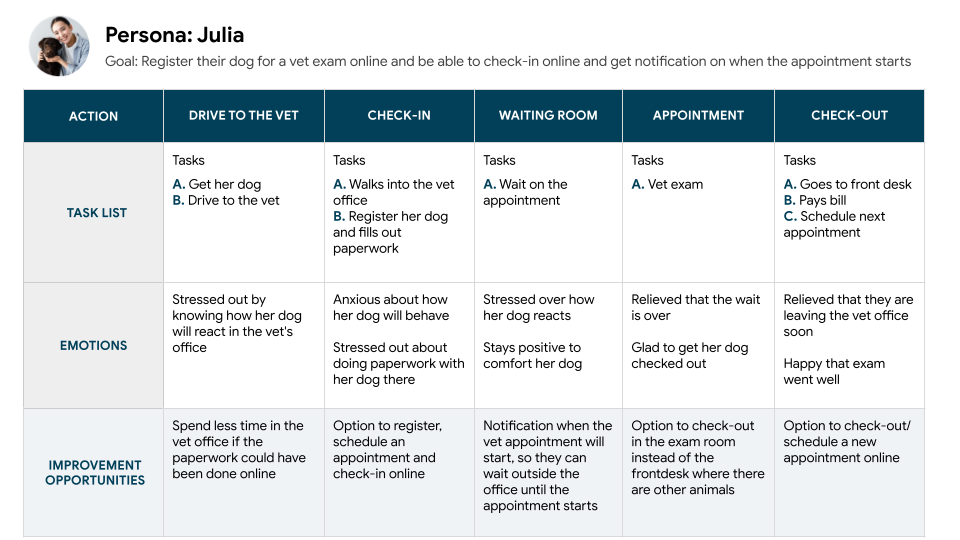
Mapping Julia’s user journey reveals how helpful it would be to have a vet website to make the registering and scheduling an easier, faster and time-saving experience for the user compare to doing all of the stressful paperwork in vet office with the pet.
Site Map
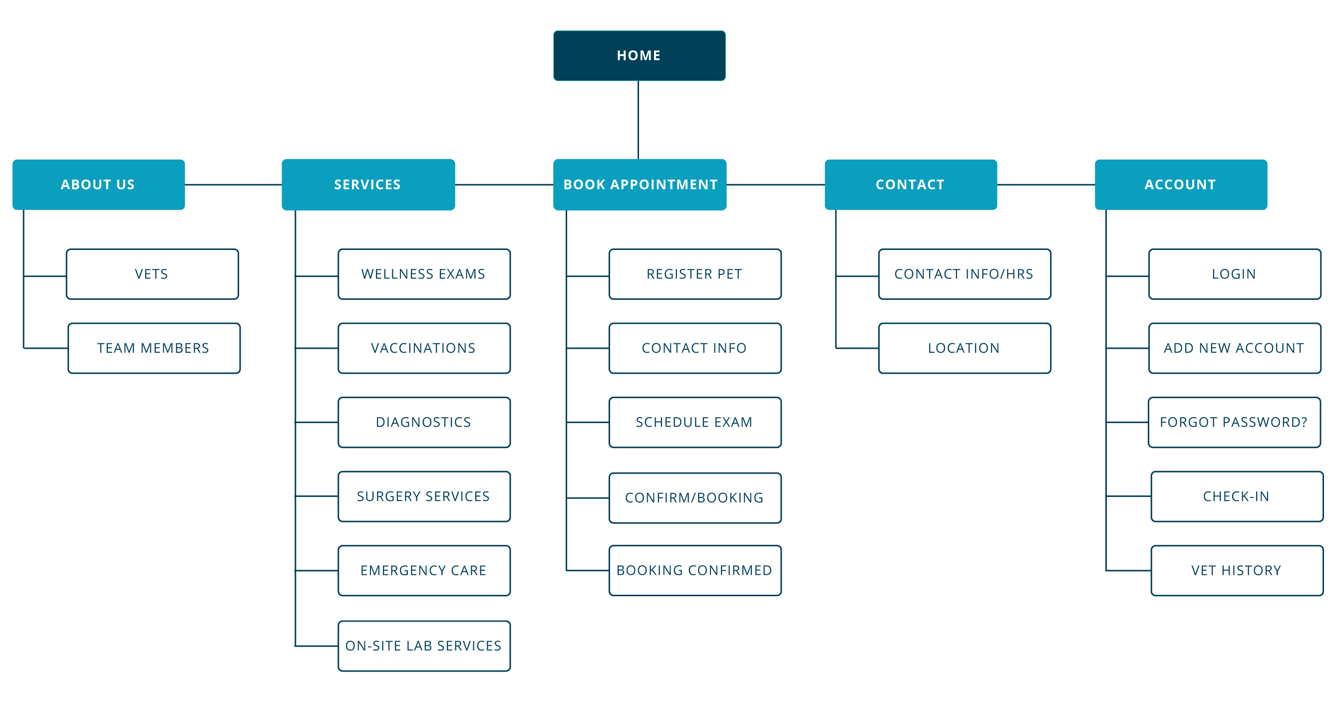
Frustration with no option to register or the option to do all of the paperwork online was the primary pain points for users. My goal here was to make strategic information architecture decisions that would improve and allow the users to register all the information needed and book appointments on the website. The structure I chose was designed to make things simple and easy.
User research pain points

Online Registration
Users get frustrated when they can’t register and schedule a vet appointment online.

Check-in

Wait Time
competitor analysis
After researching direct and indirect competitors to Vet for your Pet, the biggest gap was the lack of an option to register your pet online. The users have to download and bring in the registration papers after booking the appointment or fill them out in the vet office with 3 out of 3 competitors. An opportunity to stand out from the competitors is to have all of the registration and booking available online without any extra paperwork.

– Have to download the registration form
– Button color have low contrast
– Alt text missing on images

– Have to download the registration form
– No brand identity
– Have to download app before booking

– Have to download the registration form
– Can only request an appointment not book it
– Website looks unprofessional visually
STARTING THE DESIGN
Wireframes, low-fidelity prototype & high-fidelity prototype
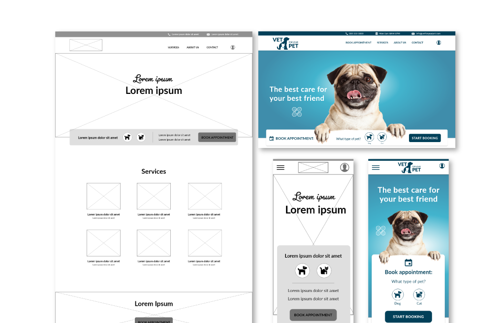
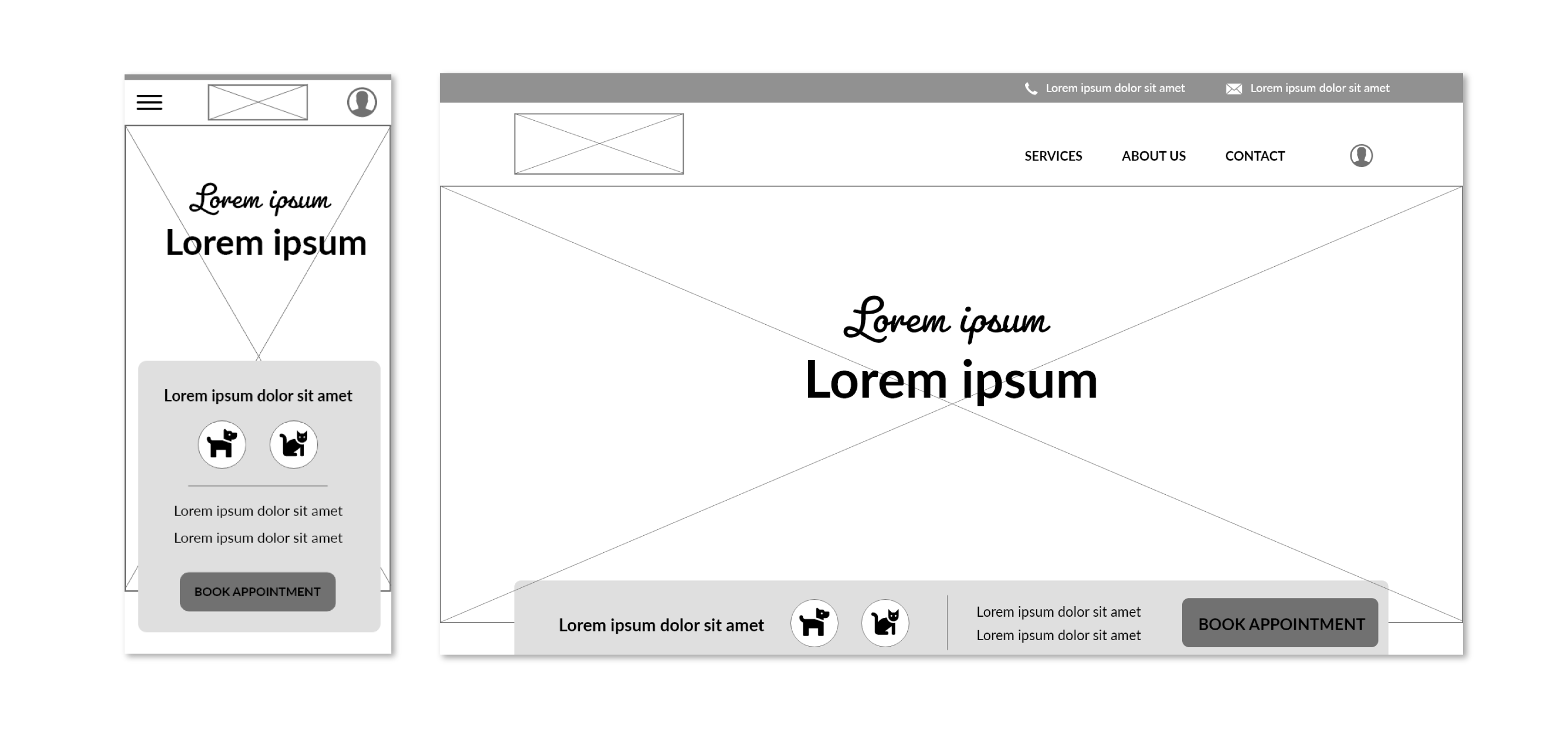
Digital Wireframes – screen size variations
Moving from paper to digital wireframes made it easy to understand how the redesign could help address user pain points and improve the user experience. Prioritizing useful button locations to book an appointment and visual element placement on the home page was the key part of my strategy.
Low-fidelity
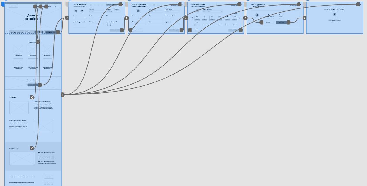
Prototype
To create a low-fidelity prototype, I connected all of the screens involved in the primary user flow to register a pet, add contact information, book a vet appointment and confirmation of the booking. At this point, I had received feedback on my designs from members of my team, about things like selecting an appointment. I made sure to listen to their feedback, and I implemented several suggestions in places that addressed user pain points.
Usability study findings

Round findings
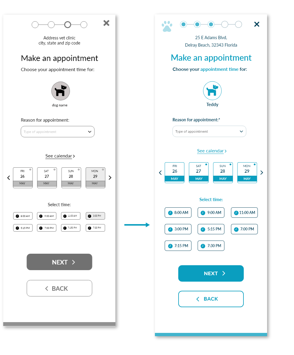
Hard to read time selection in the booking in the mobile version.
High-fidelity
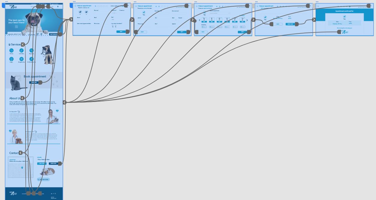
prototype
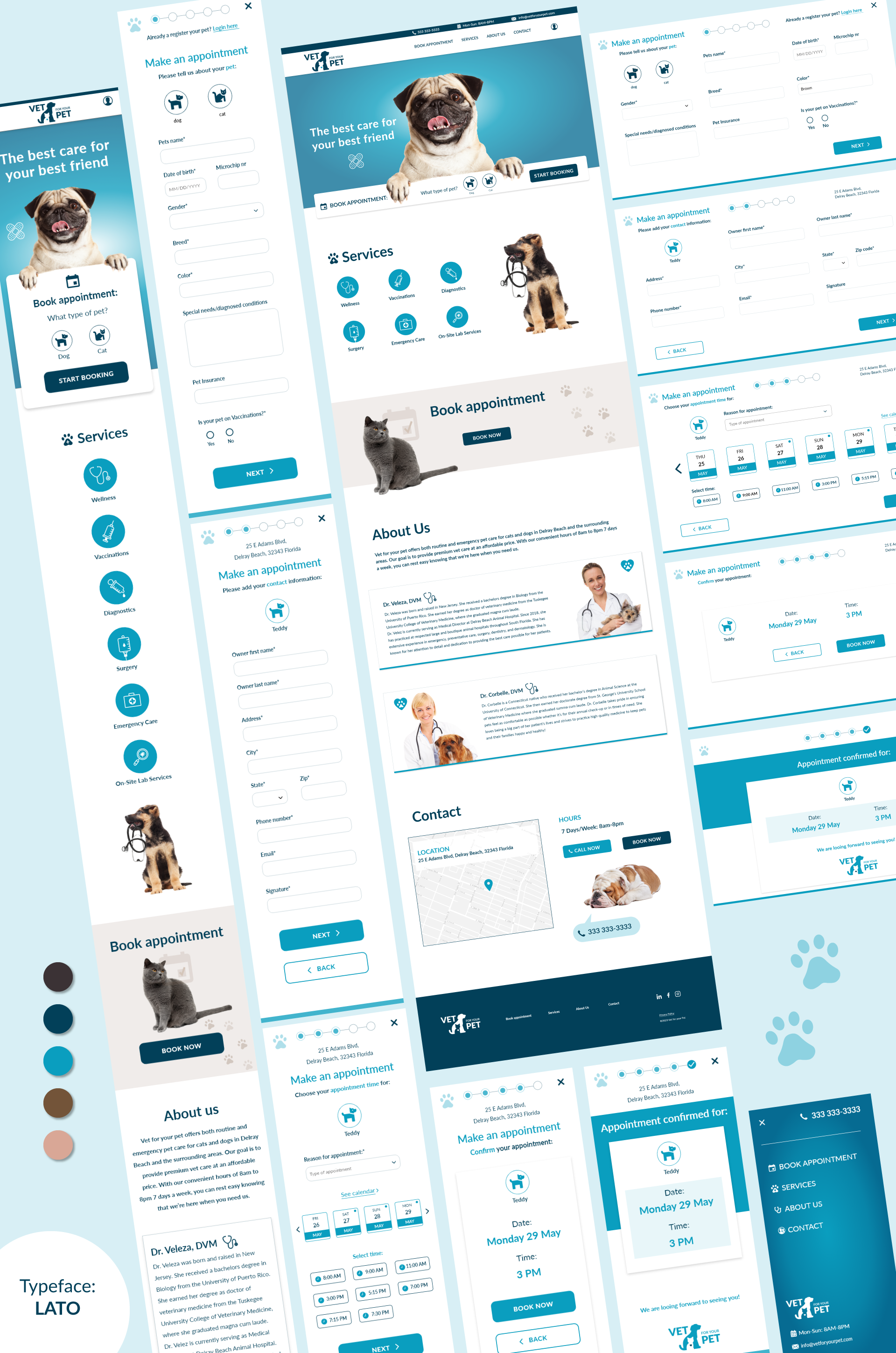
My hi-fi prototype followed the same user flow as the lo-fi prototype, and included the design changes made after the usability study, as well as several changes suggested by members of my team.
High-fidelity Mockups
I included considerations for additional screen sizes in my mockups based on my earlier wireframes. I felt it was important to optimize the booking experience for the different size variations for the smoothest experience possible.
Accessibility considerations:

added for a clear visual hierarchy

Alt text where added to the images for
smooth screen readers access

