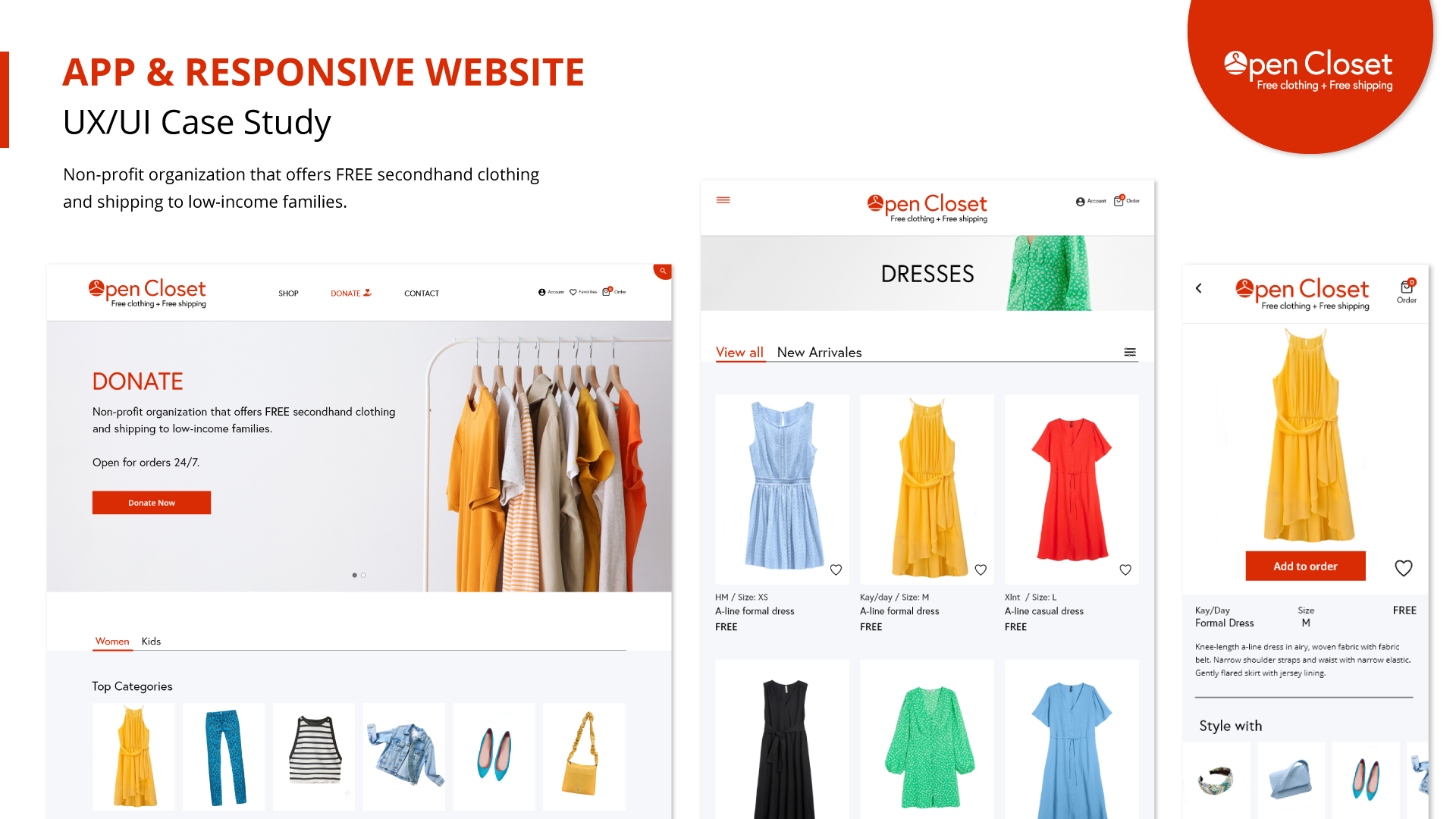
The product:
Open Closet is a nonprofit organization (social good) that wants to offer FREE secondhand clothing and shipping to low-income families. The organization needs an ordering app so that users can easily order clothes. The target users are young adults with limited income who have a hard time finding clothing at their local nonprofit clothing locations.
Project duration:
March 2023 to April 2023
My role:
UX designer leading the app and responsive website design from conception to delivery.
My responsibilities:
Conducting interviews, paper and digital wireframing, low and high-fidelity prototyping, conducting usability studies, accounting for accessibility, and iterating on designs and responsive design.
Tools:
Adobe Xd, Photoshop and Illustrator.
The problem
Finding free secondhand clothing at nonprofit organizations can be very challenging and hard to find with limited opening hours. Open Closet has identified that a lot of people will benefit from having the opportunity to order free clothing 24/7.
The goal
Design an app that will help people with limited income to easily find and order free secondhand clothes.
UnderstandING the User
User research, empathy map, persona, site map and user pain points
USER research summary
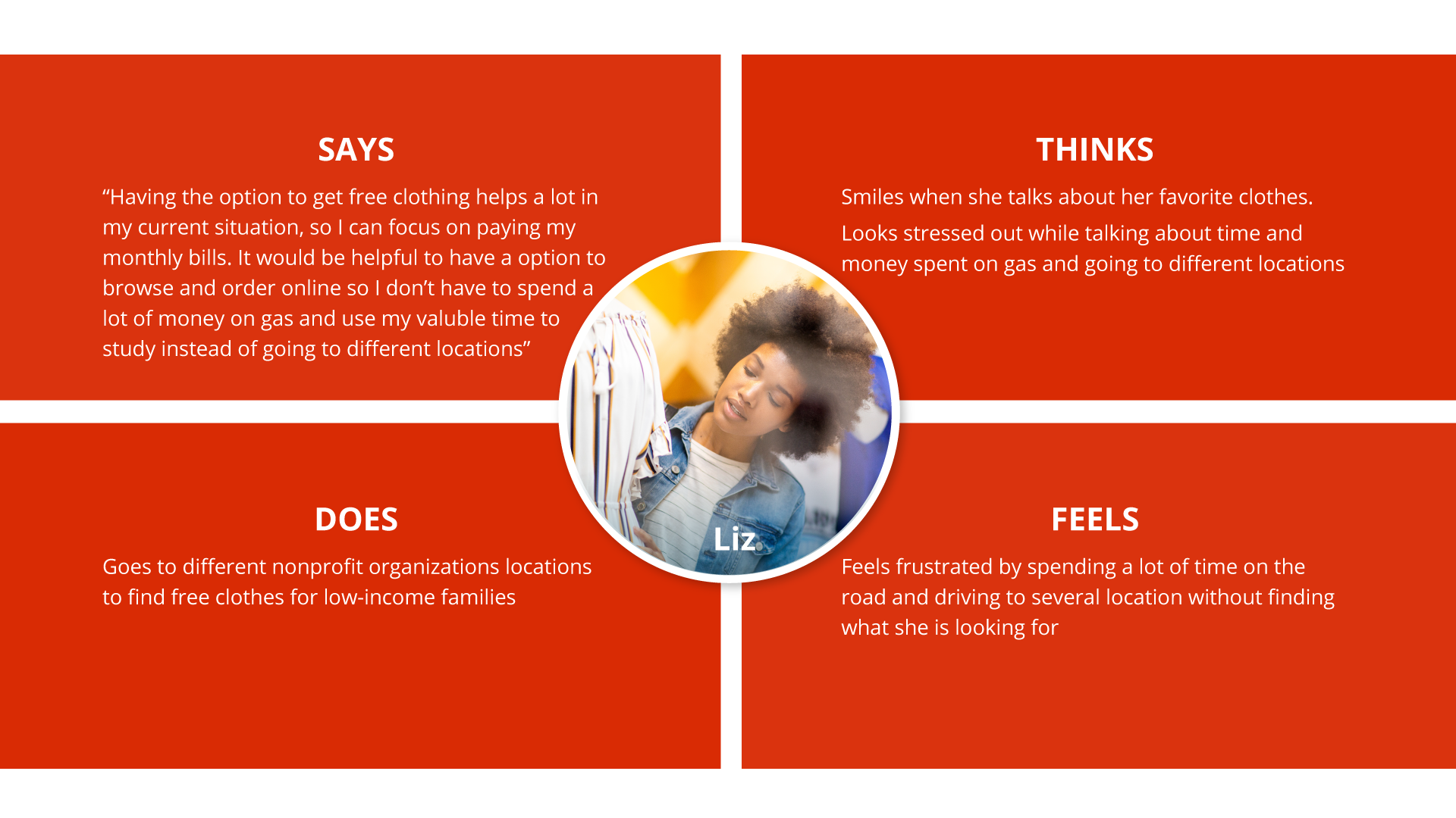
I conducted user interviews which I then turned into empathy maps to better understand the target users and their needs. A primary user group identified through research was young adults with limited income and busy schedules having a hard time finding clothing at nonprofit locations within the opening hours. The feedback from the research made it very clear that an app where the users can browse specific categories will save them a lot of frustration without having to look through unorganized clothes, and also save time and money on transportation by getting the clothes delivered.
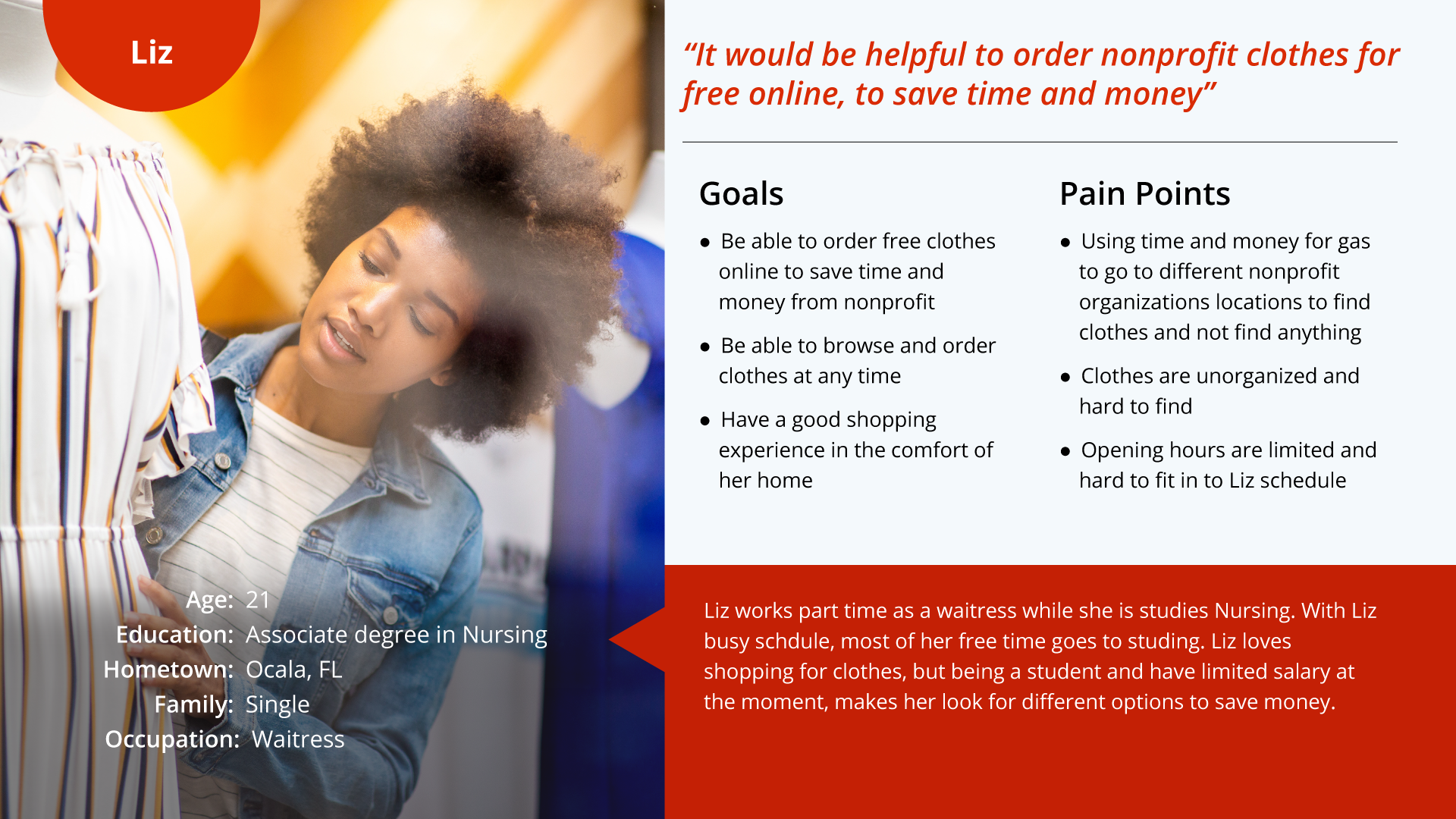
Persona 1: Liz
Problem statement:
Liz is a busy student and a part-time waitress who needs an easier option to look for free clothes from nonprofit organizations because she wants to save time and money without driving to different unorganized locations with limited opening hours.
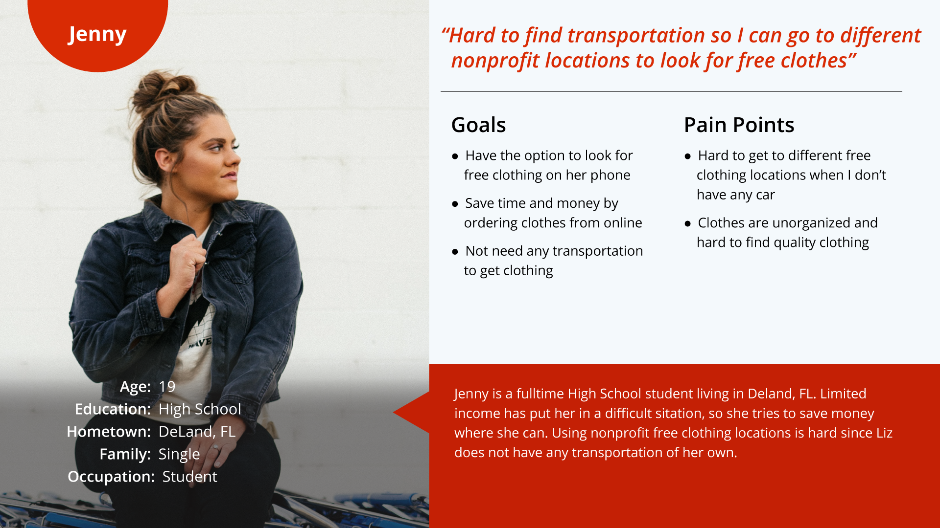
Persona 2: Jenny
Problem statement:
Jenny is a busy student who needs an easier and better option to get free clothing from nonprofit organization locations because she wants to focus her time on studying and save money where she can without needing any transportation.
User Journey Map
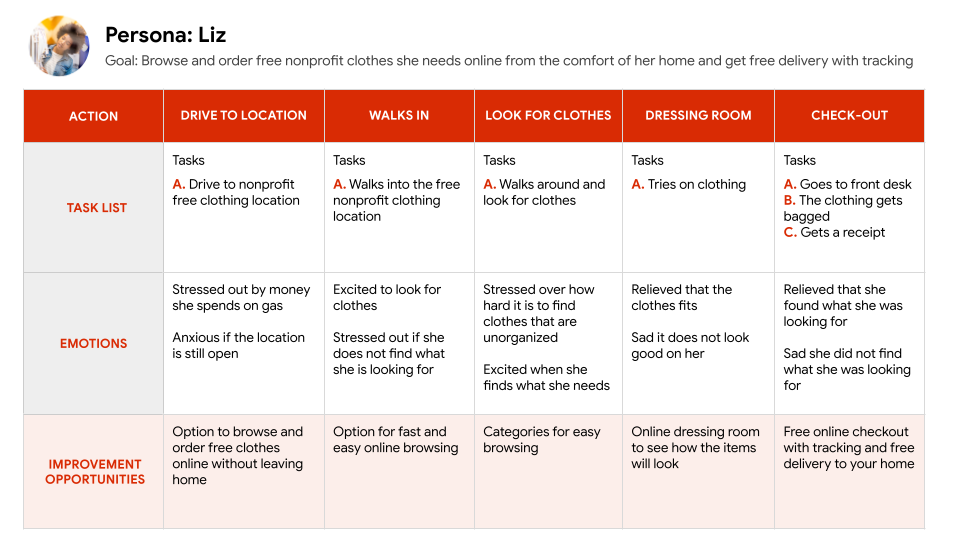
Mapping Liz’s user journey reveals how helpful it would be to have an app for online browsing and ordering of free clothes from a nonprofit organization to save time, money and to easily find what you are looking for.
Site Map
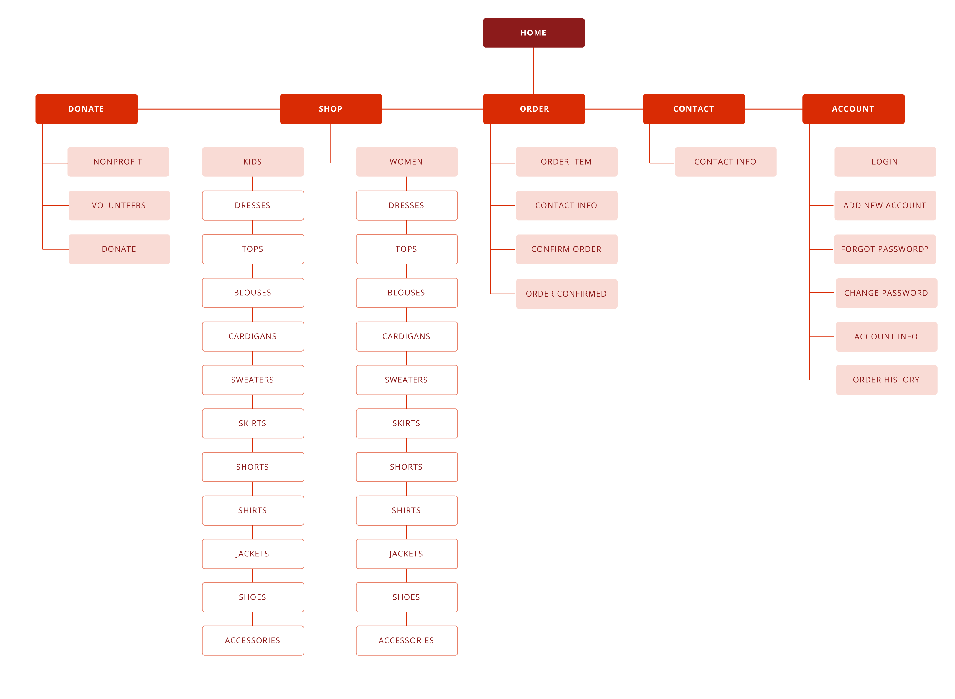
This sitemap for the Open Closet website shows the top-down layout of the site. This sitemap uses a hierarchical structure and shows the parent/child relationship of categories and subcategories. My goal here was to make strategic information architecture decisions that would make it easy for the user to navigate through the categories of the app.
User research pain points

Unorganized clothes
Users get frustrated when they look through unorganized clothes without finding what they are looking for.

Opening hours
Users are having a hard time getting to nonprofit clothing locations within the opening hours.

Transportation
competitor audit
An audit of a few competitors’ products provided direction on gaps and opportunities to address with the Open Closet app. One of the finds where none of the competitors offered free clothing and shipping.
Local nonprofit
(Direct)
+ Offers free clothes
– Have to go to the location
– Limited opening hours
Thredup
(Indirect)
+ Online ordering
+ Can swap clothes and get credit
– Clothing and shipping cost money
Swap
(Indirect)
+ Online ordering
+ Offer clothes for the whole family
– Cost money
STARTING THE DESIGN
Wireframes, low-fidelity prototype & high-fidelity prototype
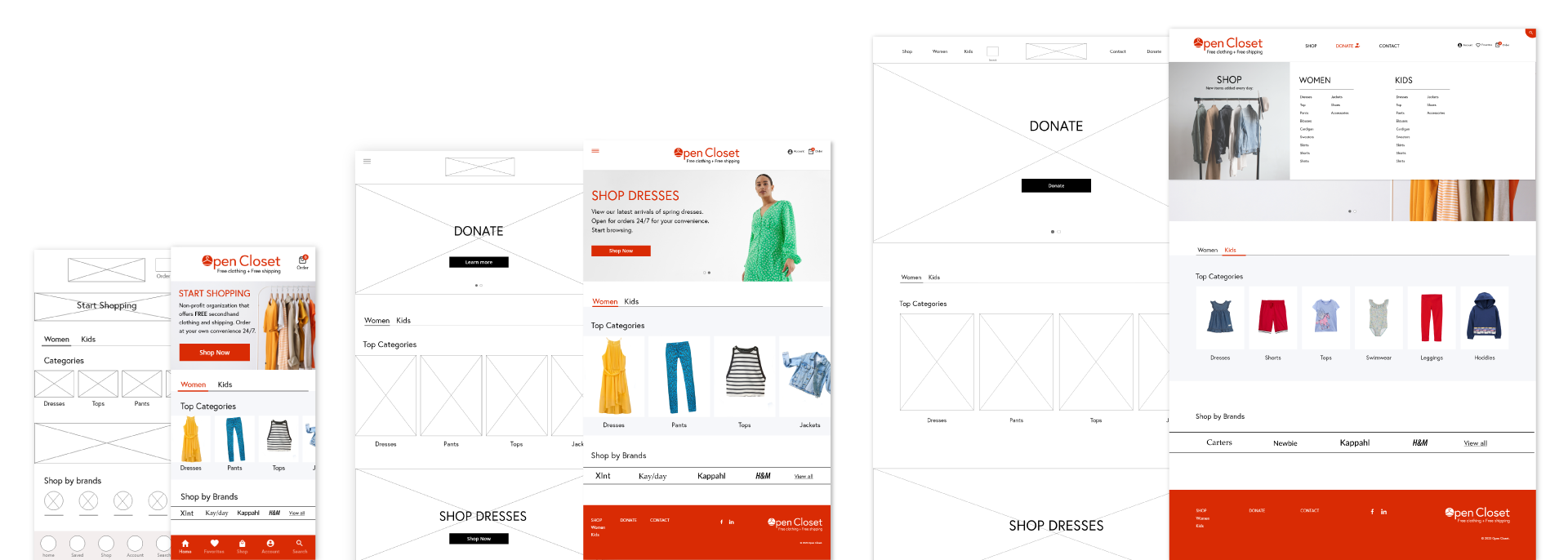
Digital Wireframes
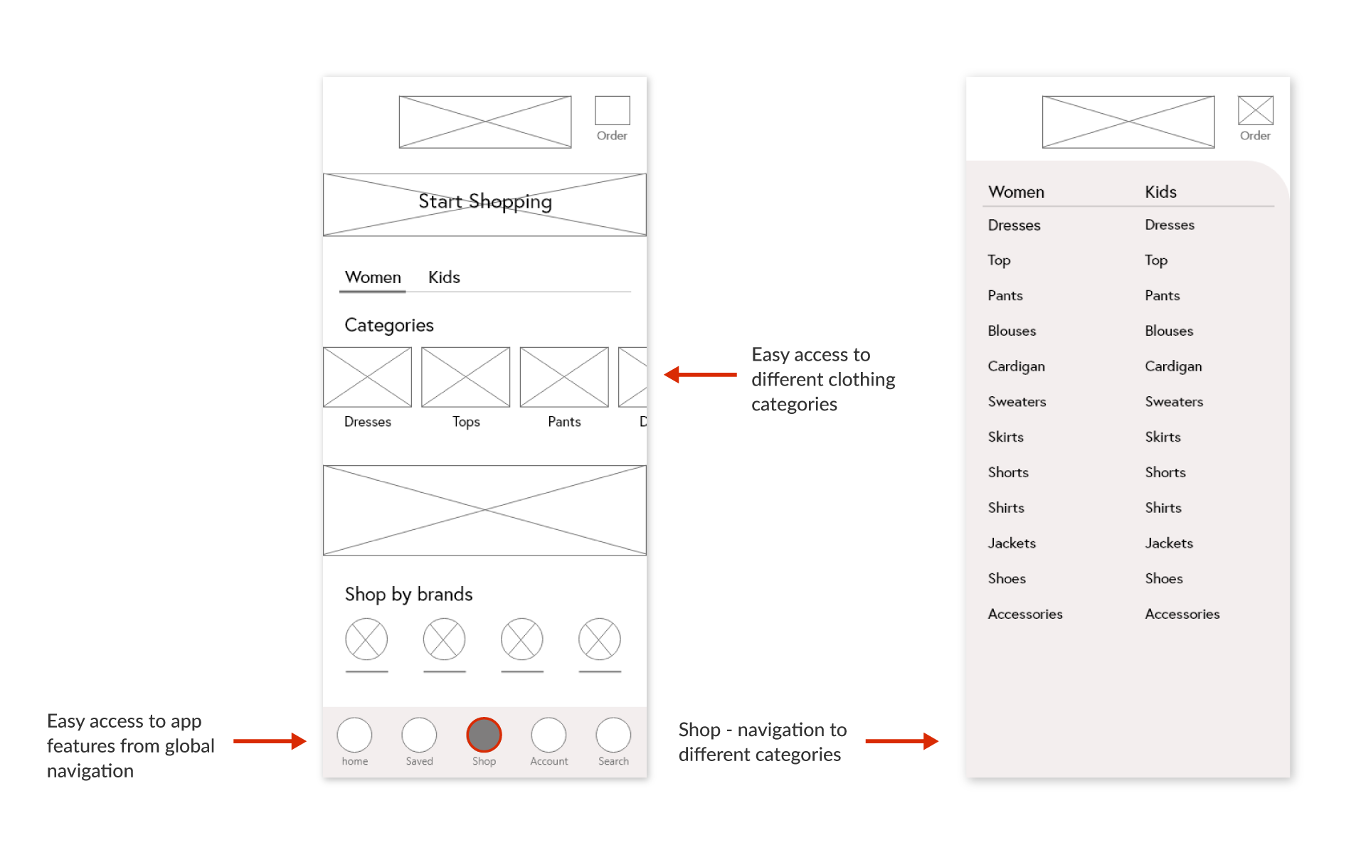
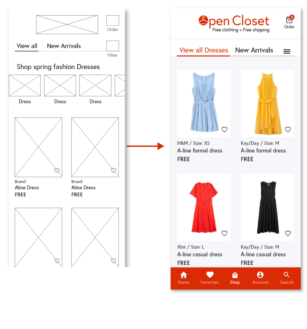
After ideating and drafting some paper wireframes, I created the initial designs for the Open Closet app. These designs focused on easy access to clothing categories, navigation, and a simple ordering function.
Low-fidelity
Prototype
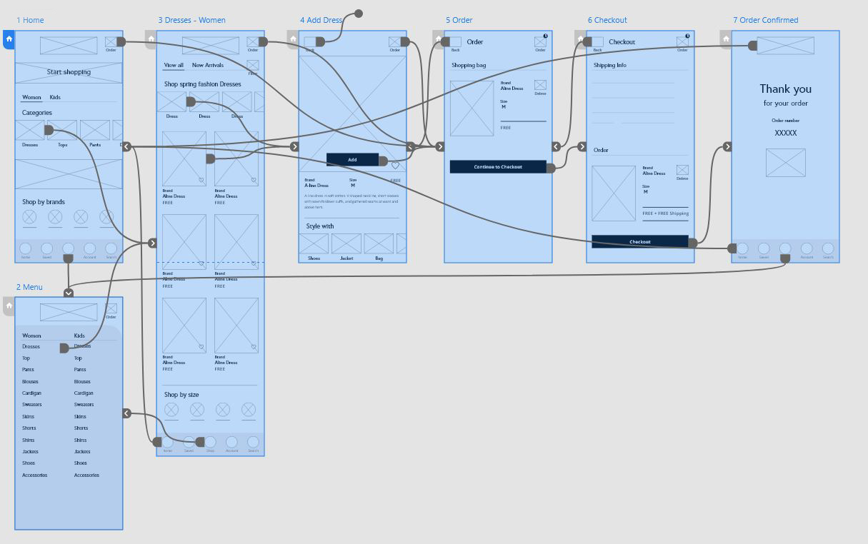
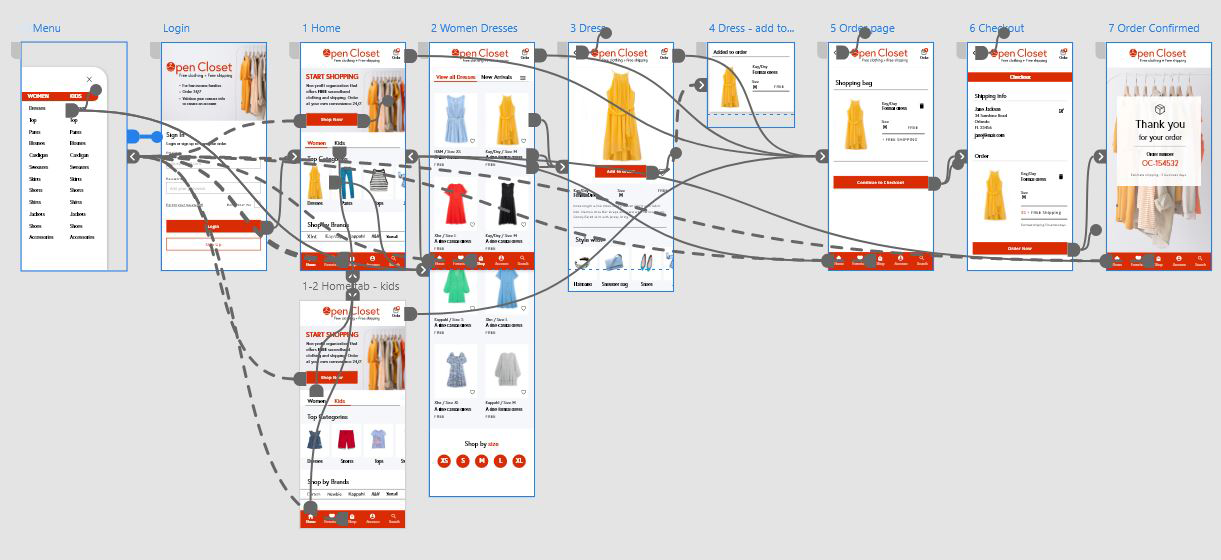
To prepare for usability testing, I created a low-fidelity prototype that connected the user flow of ordering an item.
Usability study findings

Round findings
Clothing sizes – Users preferred to know the size of the item before clicking on each item.
Validation on items added to the cart – Users need validation that an item is added to the order.
Gets redirected to the order page after adding an item – The user needs to stay on the same page after adding an item.
High-fidelity
Prototype
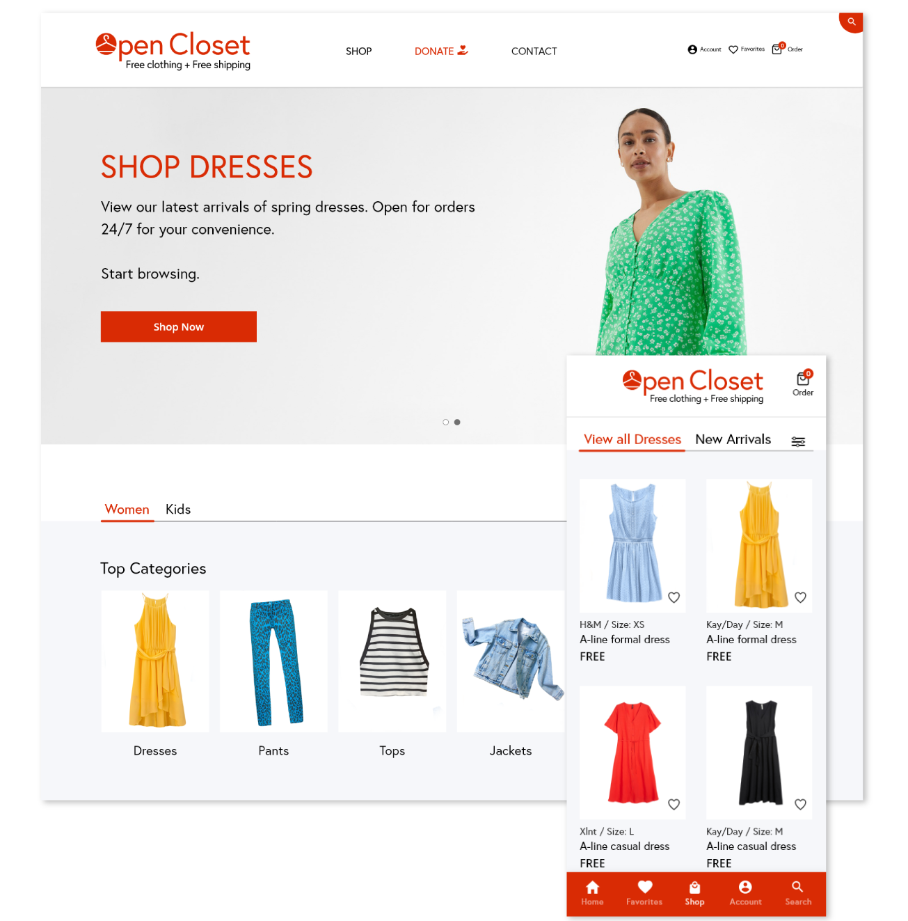
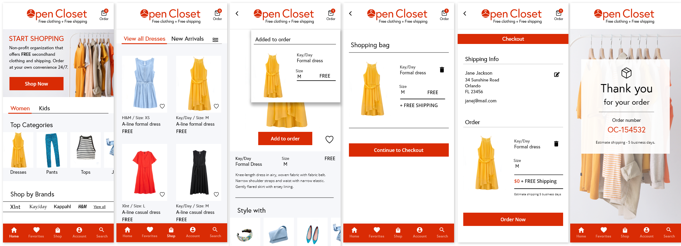
The high-fidelity prototype followed the same user flow as the low-fidelity prototype, including design changes made after the usability study.
High-fidelity Mockups – Dedicated Mobile App
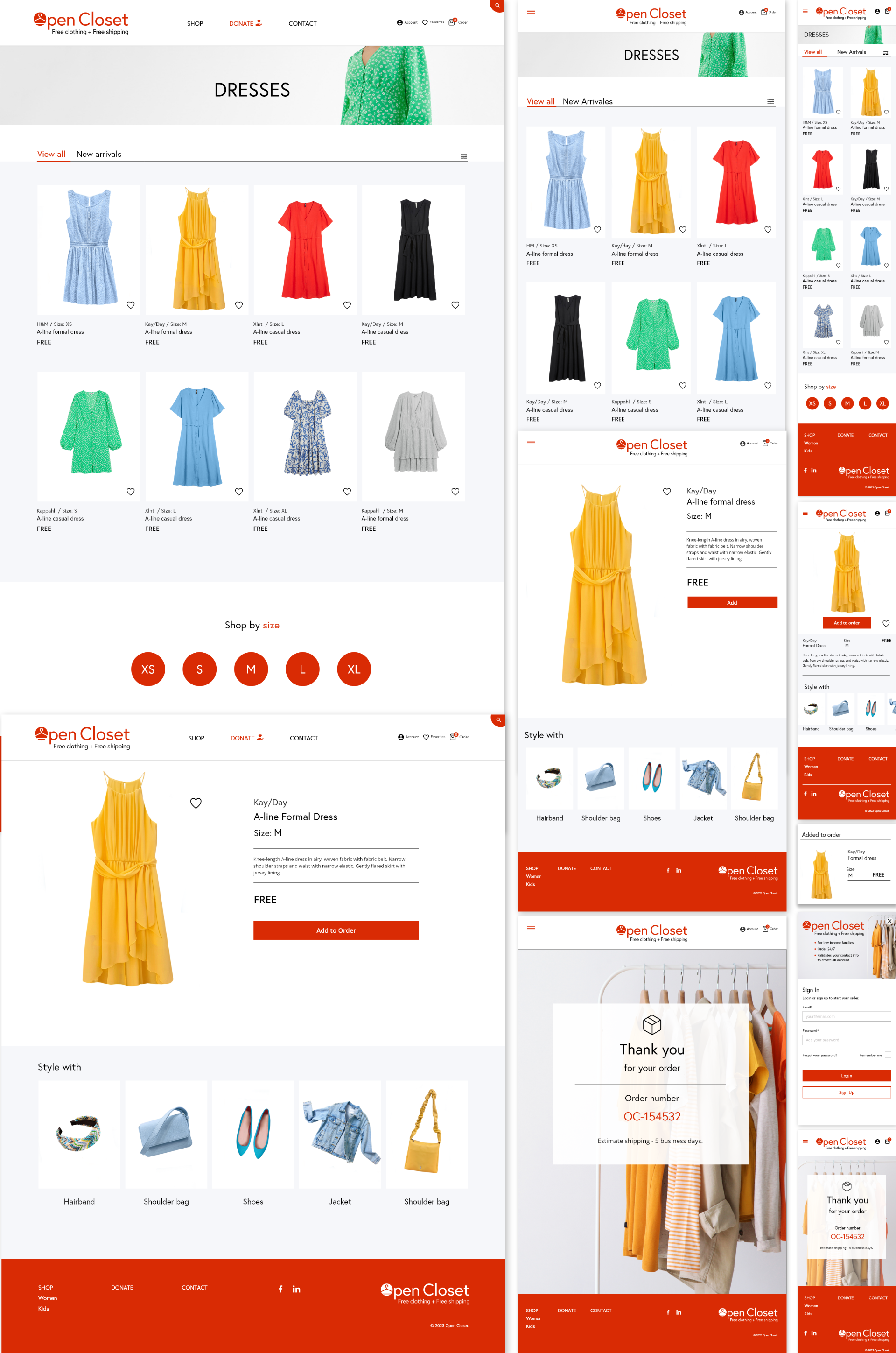
High-fidelity Mockups – Responsive Website


Takeaways
Impact:
What I learned:

