Project overview
The product:
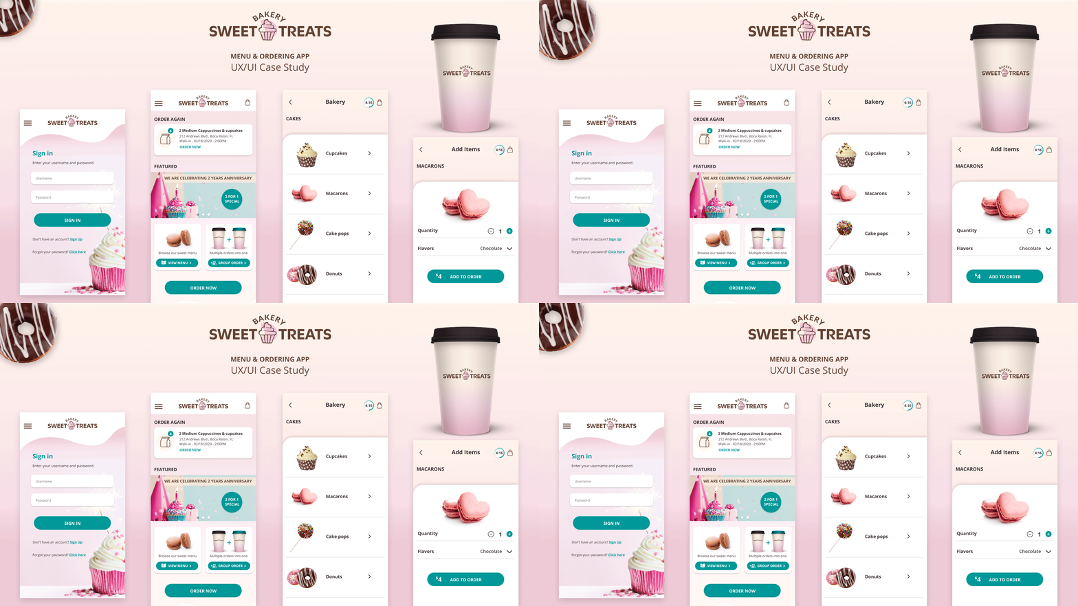
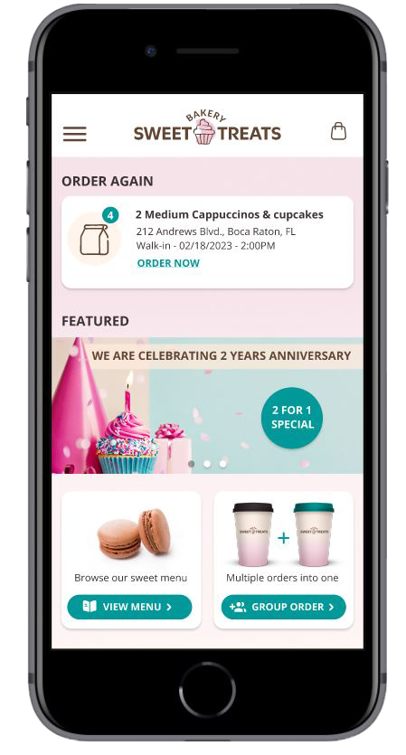
Sweet Treats Bakery focuses on homemade treats. This has expanded into several locations in the suburbs of metropolitan areas. The bakery offers a wide range of baked goods and coffee at an affordable price. Sweet Treats Bakery targets customers with busy lifestyles who lack the time to make their own baked goods and coffee.
Project duration:
December 2022 – February 2023
My role:
UX designer – designing an app for Sweet Treats Bakery from conception to delivery.
My responsibilities:
Conducting interviews, paper and digital wireframing, low and high-fidelity prototyping, conducting usability studies, accounting for accessibility, and iterating on designs.
Tools:
Figma, Photoshop and Illustrator.
The problem
Busy career-driven adults who want to avoid spending their valuable time in long lines to buy baked goods and coffee.
The goal
Design an app for Sweet Treats Bakery that allows users to easily order on the go and receive tracking information for when to pick up their order in the pickup zone, without spending any valuable time in lines.
Design process
Creating a great product for the users is the main goal, therefore iterate and working between the phases are crucial to find the solution that meets the users needs.



UnderstandING the User
User research, personas, problem statements
& user journey maps
USER research summary
I conducted interviews and created empathy maps to understand the users needs for the Sweet Treats Bakery. A primary user group identified through research was busy career-driven adults that order on the go and who are early to mid-level in their careers.
This user group confirmed initial assumptions about Sweet Treats Bakery customers, time-saving is one of the biggest factors for ordering through an app. Research also revealed that more can be done for even faster ordering: functionality that remembers your previous order, layout and items categories in a better order and an option for group order with multiple users for faster checkout.
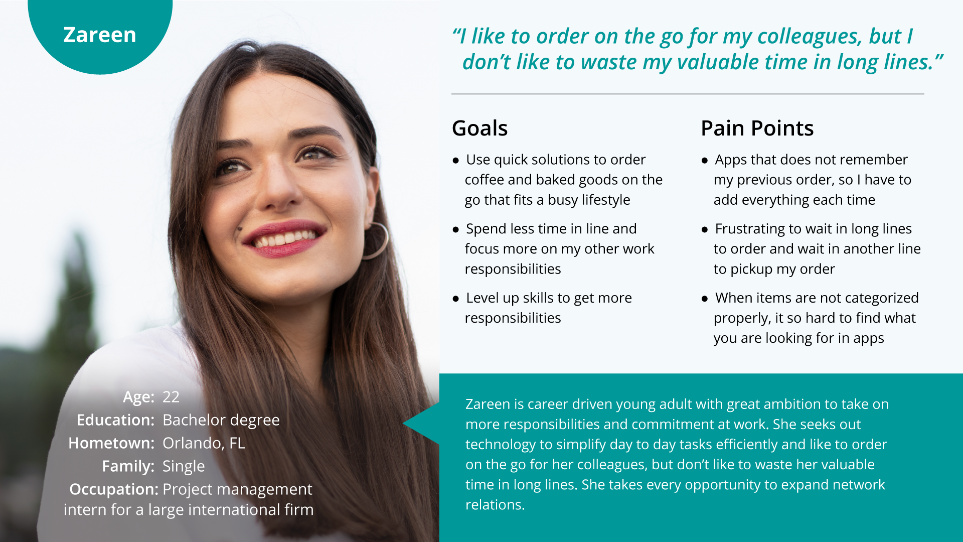
Persona: Zareen
Problem statement:
Zareen is a career driven
young adult who needs a quick and easy solution to order coffee and baked goods for colleagues on the go. Because of tight timelines, she needs to focus more on other tasks at work instead of spending her time in long waiting lines.
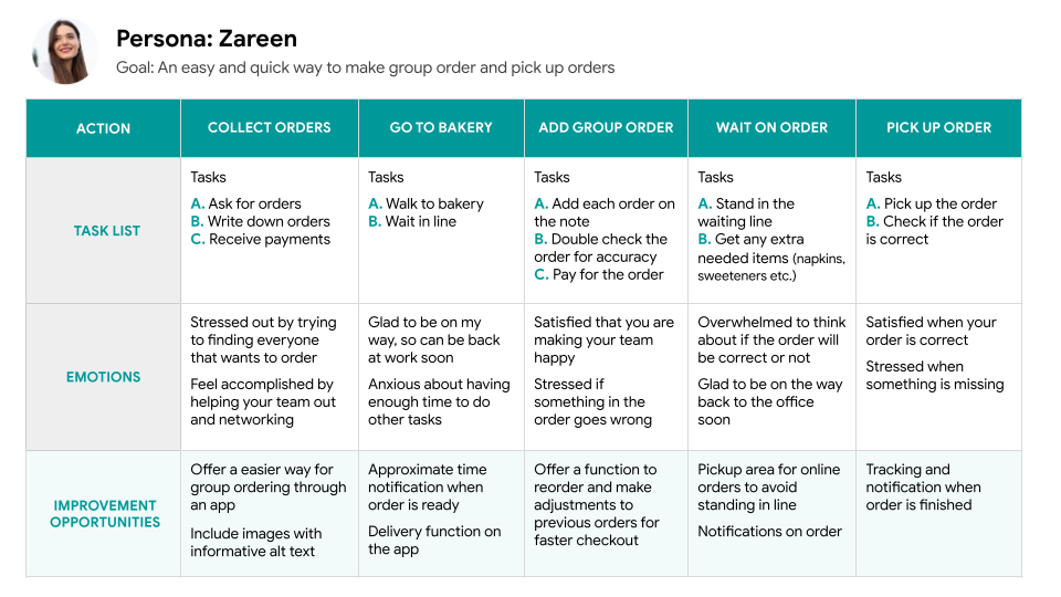
User research pain points

TIME

LAYOUT

ORDER & PICKUP
Competitive audit findings
MOMA BAKERY (Direct)
+ Online ordering
+ Clear indication of clickable elements
+ Clean design
– Small images & missing images
– Can’t order coffee online
– Require two business days to schedule delivery on some online orders
ARI BAKERY (Direct)
+ Large images
+ Easy navigation
+ Easy to find key info (menu, location +)
– Confusing branding and concept
– No online ordering
– Missing ALT text
– Repeated copy
CHEESECAKE BAKERY (Indirect)
+ Engaging animations
+ Clear branding
+ Menu is compatible with screen reader
– Rewards program on selected locations
– Overwhelming menu selection
– Missing images on some menu items
STARTING THE DESIGN
Storyboards, user flow, paper wireframes, digital wireframes, low-fidelity prototype & high-fidelity prototype
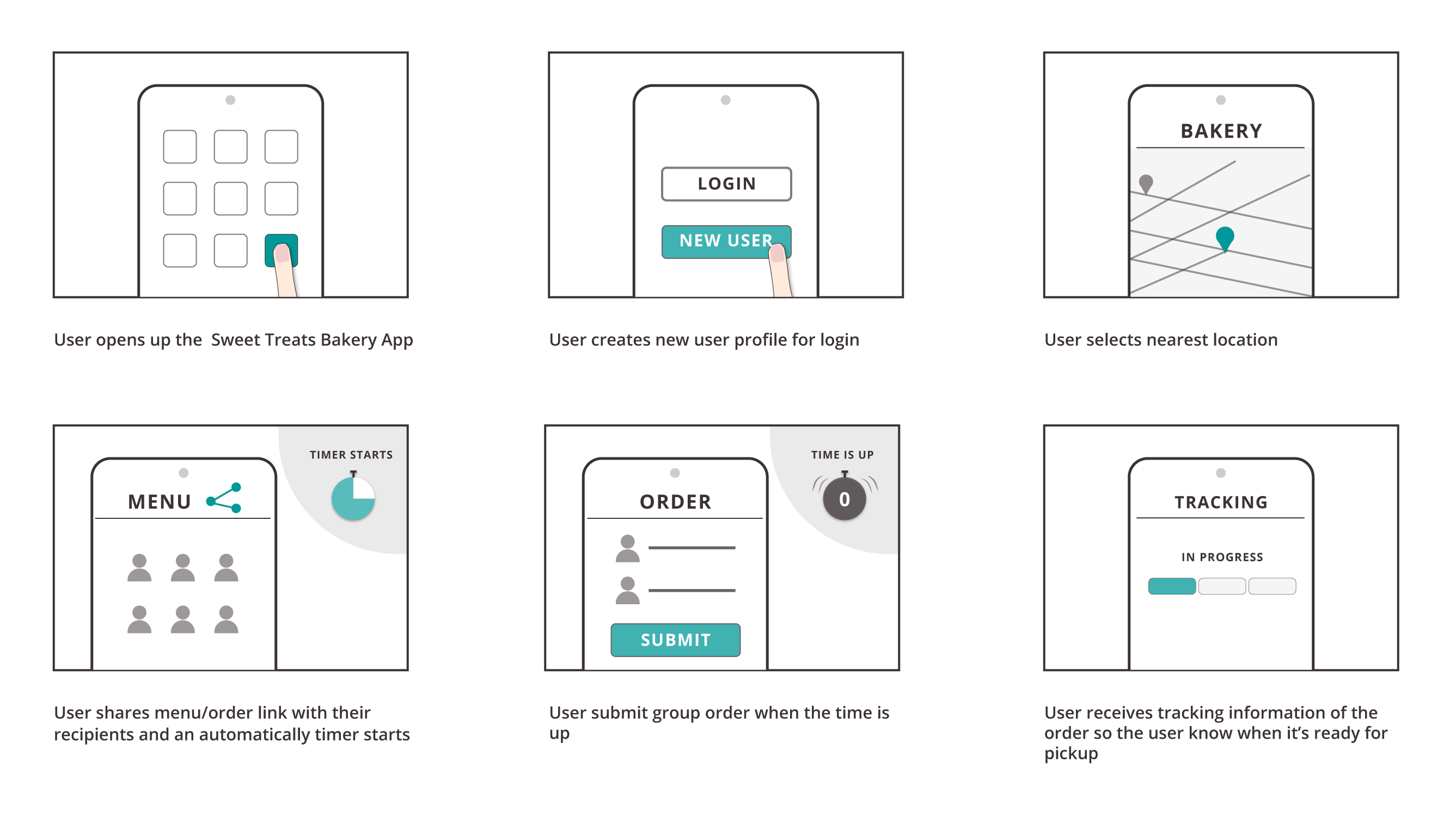
Close-up Storyboard
Scenario: Use the Sweet Treats bakery app to quickly and easily place group orders in advance and get tracking information on the order.
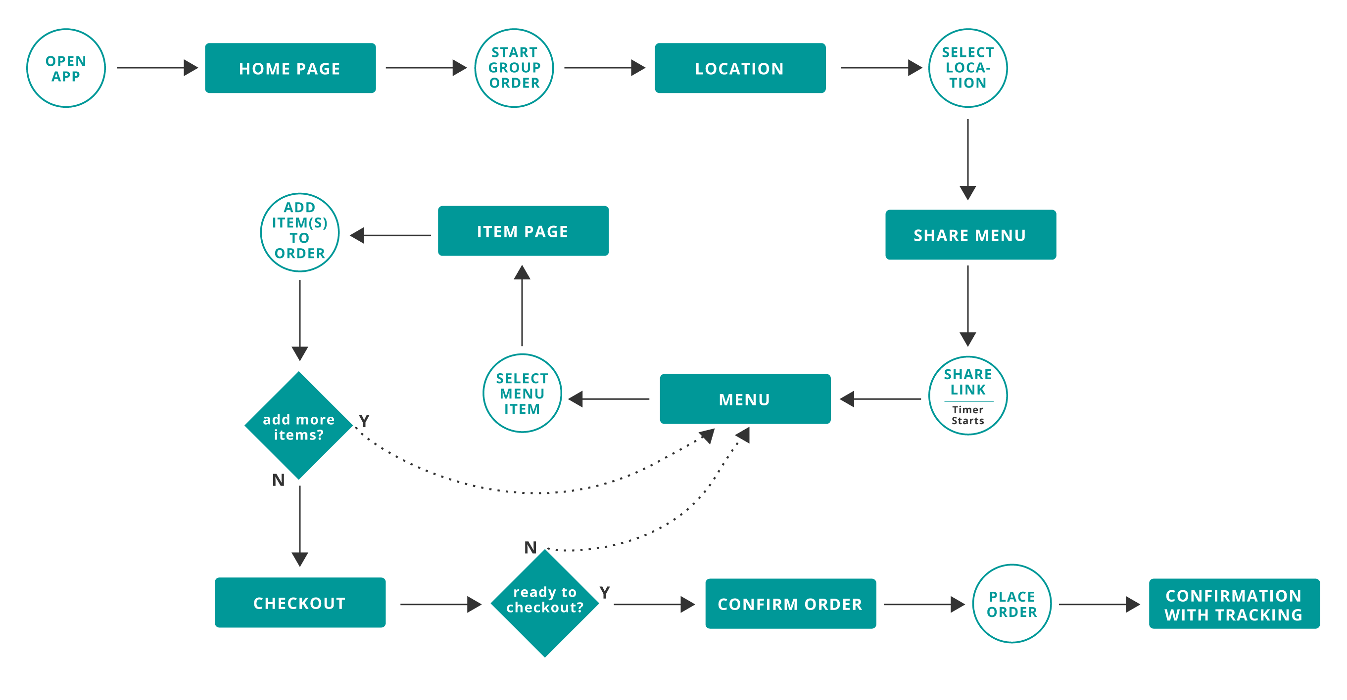
User Flow
Group Order Flow
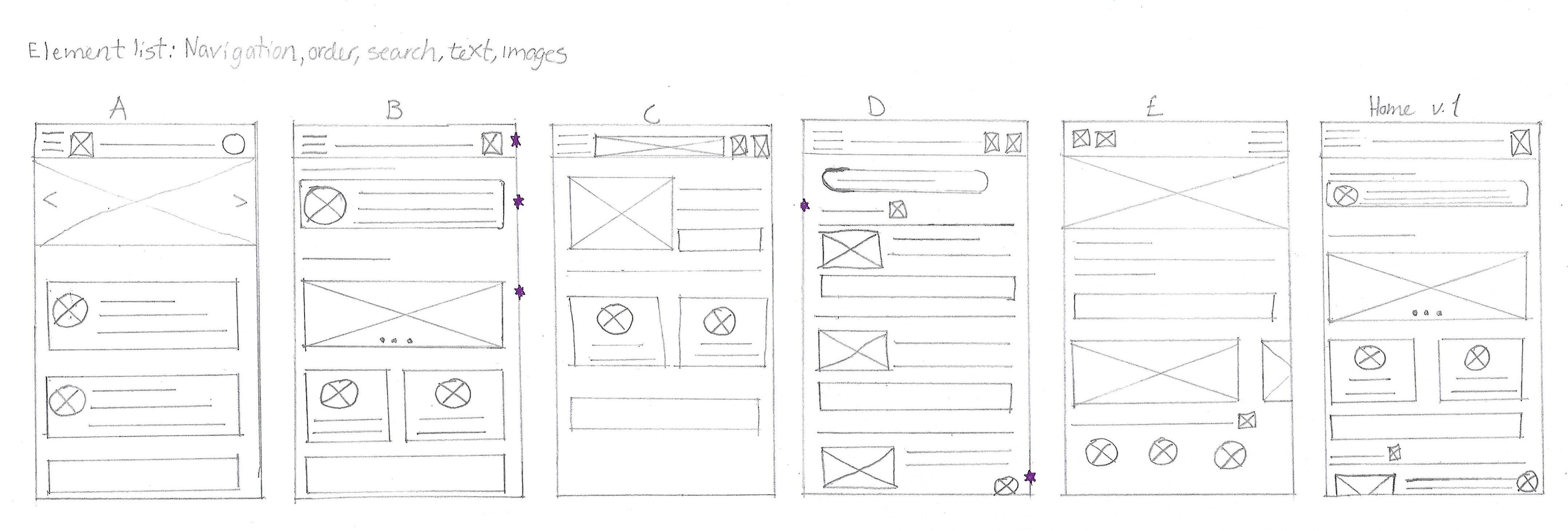
Paper Wireframes
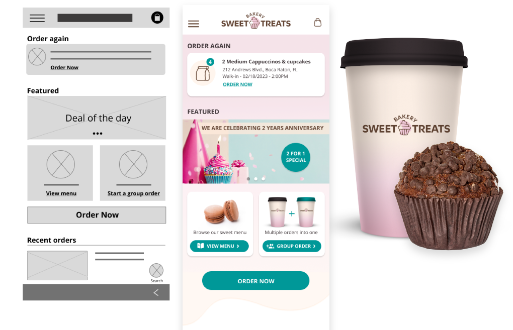
Taking the time to draft iterations of each screen of the app on paper ensured that the elements that made it to the digital wireframes would be well-suited to address user pain points. For the home screen, I prioritized a quick and easy group ordering process and access to previous orders to help users save time.
* Stars were used to mark the elements of each sketch that would be used in the initial digital wireframes.
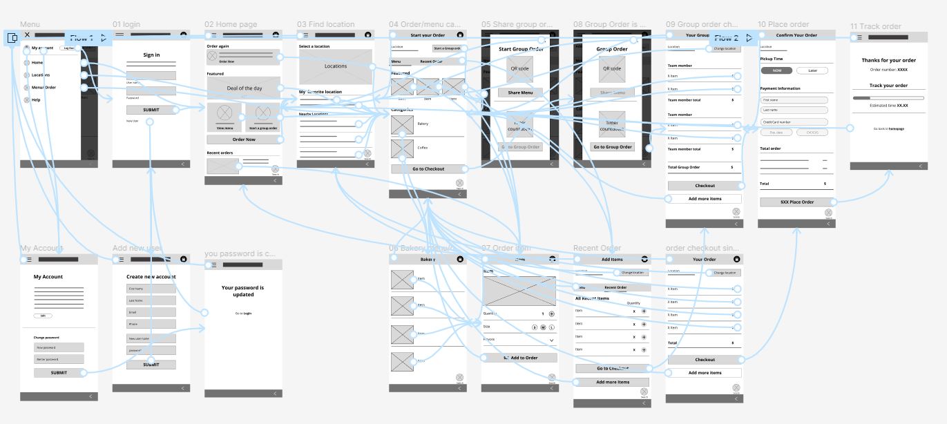
Low-fidelity
Prototype
In the low-fidelity prototype, the user can go through the main process of starting a new group order, adding items, confirming that the order is correct, and submitting the order. Users can complete a task or user flow, move forward and backward, and navigate with the cues included so the prototype could be used in a usability study with users.
Usability study findings

Round findings
1. User wants a faster order process
2. User wants location validation
3. User wants a visible group order timer
Before and After
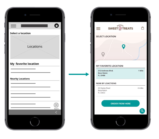
Order from here button was also added so the user can confirm the selection.

Round findings
1. More prominent group order CTA button
2. Add hierarchy to categories title and items links in the menu for visual effect
3. Users wants add more items to stand out
Before and After
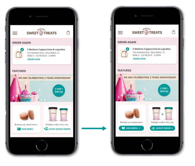
Green group order button was added for contrast and better visibility.
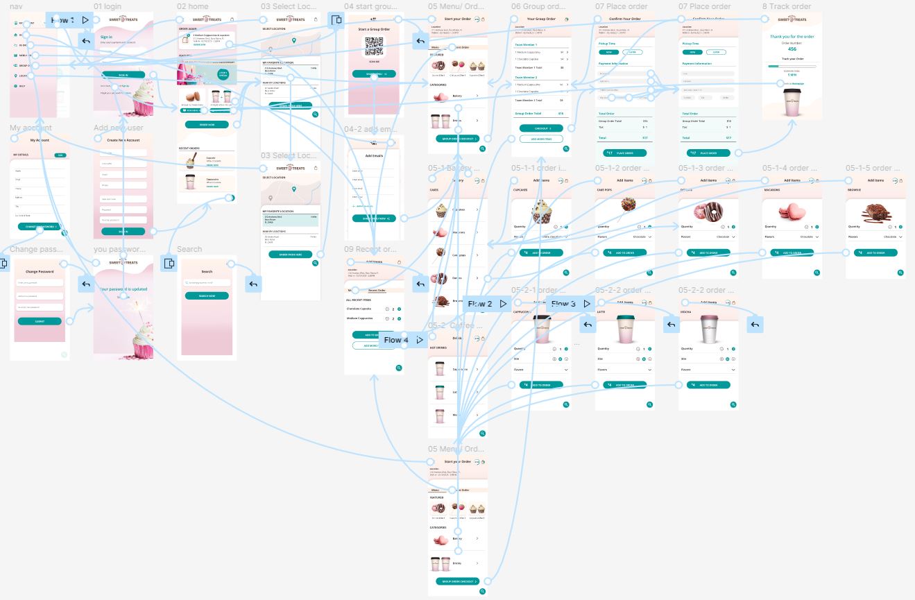
High-fidelity
prototype
The final high-fidelity prototype presents cleaner user flows for starting a group order and reordering your previous order. It meets the user’s need for adding more than one order with multiple users options and also tracks the order so the customer knows when it’s ready for pickup.
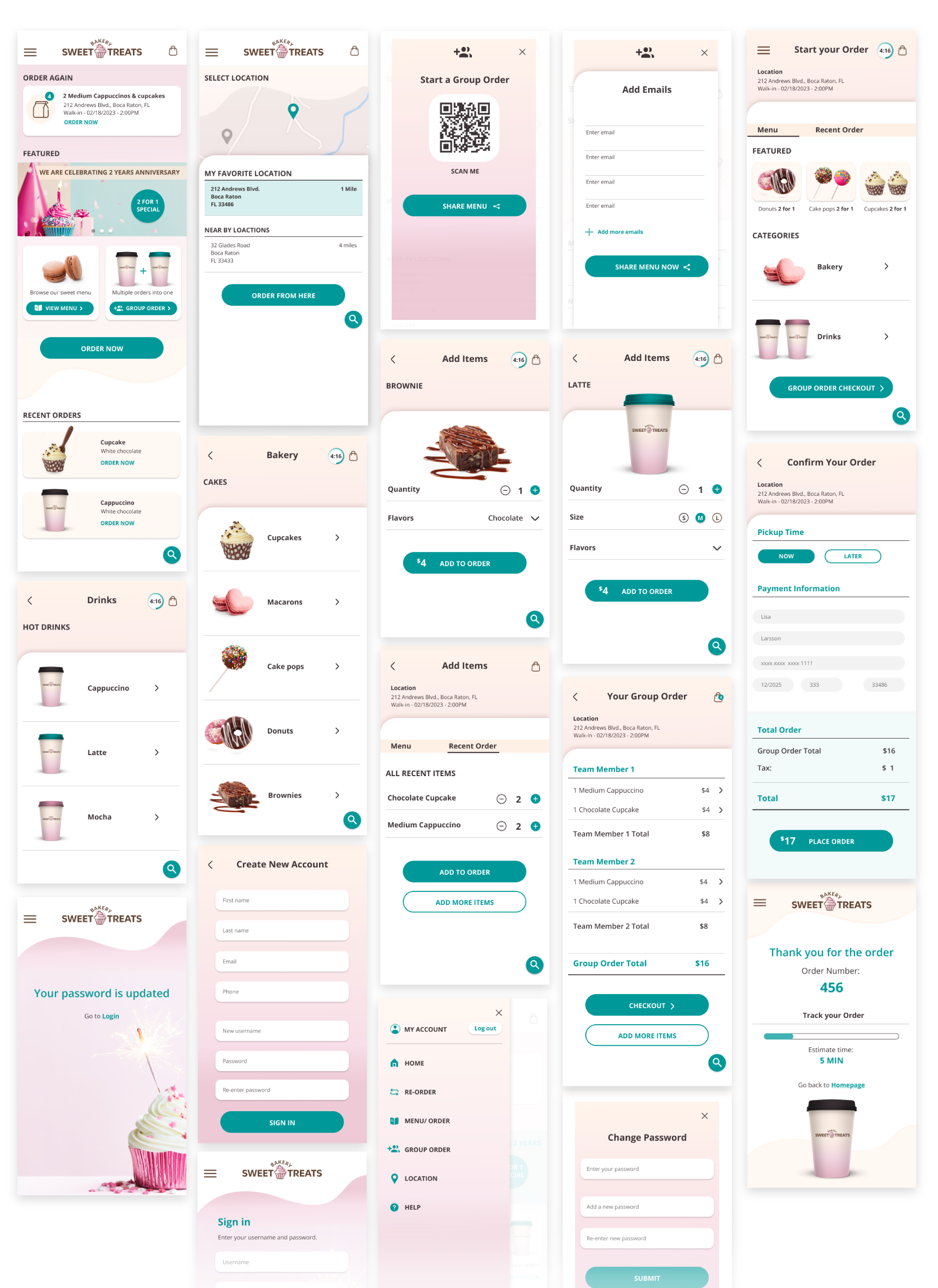
Test sweet treats bakery app
Takeaways
Impact:
What I learned:
While designing the Sweet Treats Bakery app, I learned how impactful the users needs are to make a product successful and how important it is to test the product and iterate after usability studies to meet the users real needs and pain points.

